

Role:
Lead Visual Design
Platform:
Web, Desktop, mobile and Ads
Overview
When Amazon partnered with Venmo to introduce a new payment option at checkout, the initiative required a full visual and UX rollout one that felt native to Amazon, respected Venmo’s playful brand personality, and clearly communicated the value of fast, easy, secure payments. As the Lead Visual Designer, I set the creative direction for the launch experience across Amazon.com and the Venmo ecosystem, ensuring consistency, accessibility, and brand trust.
Solution
A Unified Visual Language for the Launch
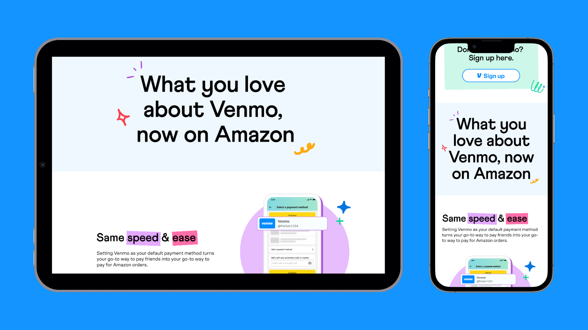
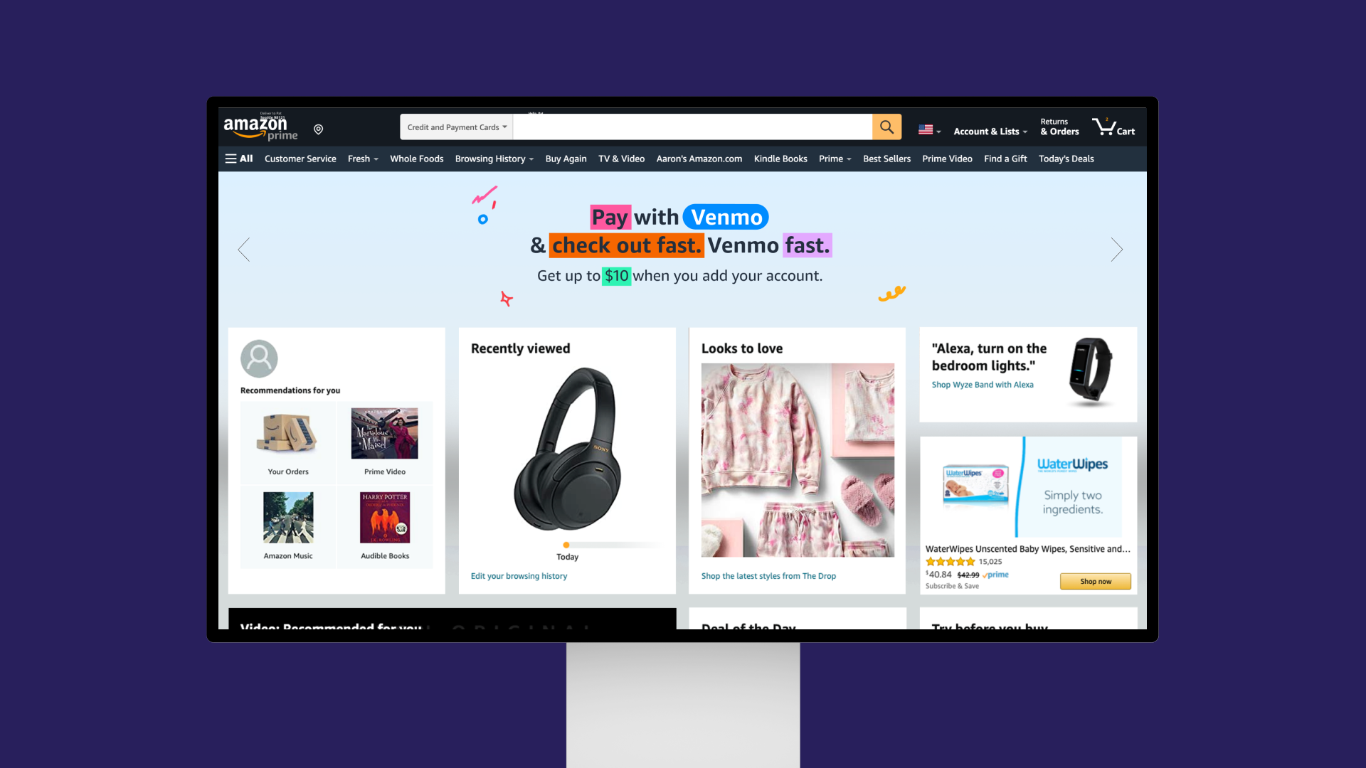
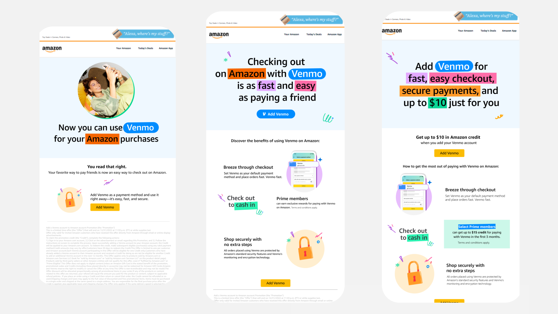
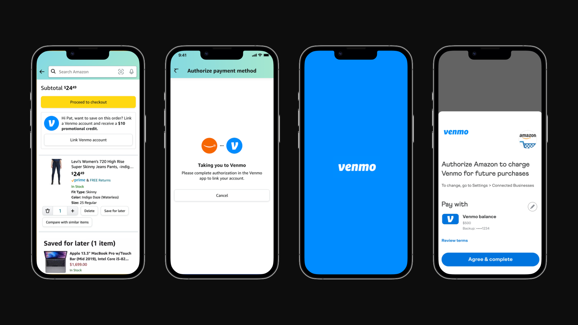
My role began with defining a cohesive visual direction that merged Amazon’s functional, scalable design system with Venmo’s vibrant personality. This included layout rules, visual hierarchy, iconography, illustration tone, and ADA-compliant color usage. I designed the core landing pages for mobile and desktop, ensuring the new experience felt seamless within the Amazon ecosystem while still being unmistakably Venmo.
I partnered closely with product, marketing, and brand teams to ensure all surfaces remained aligned—from the hero page to the onboarding modules. Because this was a major cross-brand launch, we had to maintain strict adherence to Amazon’s typography, grid, and component guidelines while introducing enough color and delight to reflect Venmo’s youthful identity.
Designing the Multi-Channel Campaign
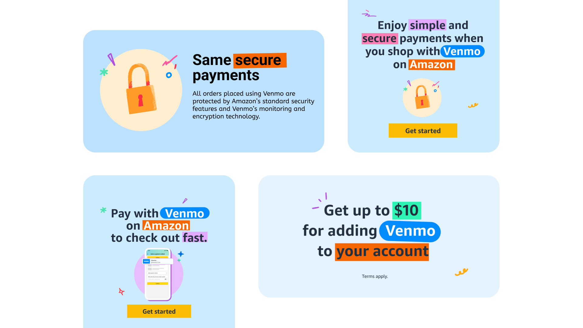
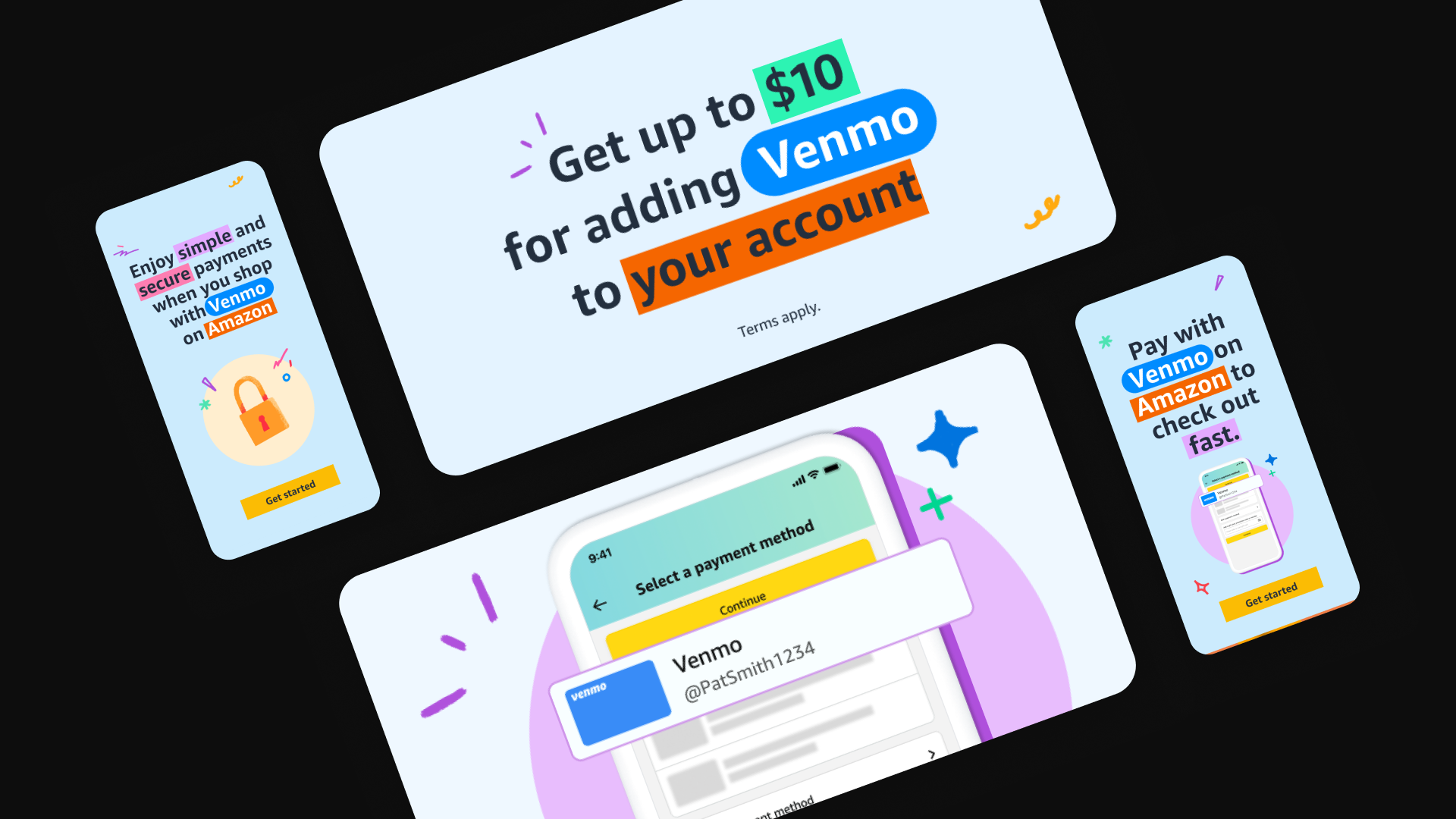
I led the complete visual system for the marketing rollout, including all ADA-compliant display ads across formats (billboards, skyscrapers, mobile banners, and in-app placements). The messaging centered around two core pillars speed & convenience and security & trust each with its own campaign theme, visual style, and call-to-action.
I worked directly with content teams to establish clear text lockups that worked across responsive breakpoints. One challenge was designing a flexible system that avoided image-embedded text (for accessibility and localization), while still delivering bold, eye-catching creative that matched Venmo’s identity. All components scaled smoothly across Amazon’s digital real estate.

Reaching New Segments — Especially Students
During early exploration and research, we identified a major opportunity: adding Venmo unlocked access to a younger, college-heavy audience that traditionally preferred peer-to-peer wallets over storing credit cards. The creative direction leaned into this behavior colorful, approachable visuals paired with simple “Add Venmo” messaging that communicated ease, speed, and the $10 Prime-credit incentive.
This insight shaped both the landing experience and the ad themes, helping Amazon position Venmo as not just another payment option, but a frictionless checkout method for digital-native shoppers.
Impact
The final campaign was a cohesive multi-channel launch that delivered clarity, trust, and strong visual branding. The experience made Venmo feel like a natural part of Amazon’s payment ecosystem and created a new, high-potential path to checkout for millions of younger customers.